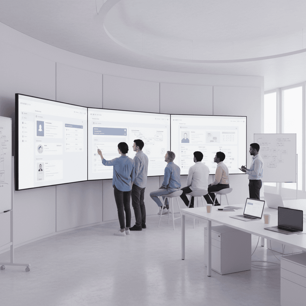
Introduction: From Writing Code to Creating Experiences
Ever shipped a feature that looked perfect in staging, passed every test, and still got ignored by users? Yeah. That stings.
It happens all the time in software engineering. A team builds something clean, fast, and technically solid, but people still click away confused. Or worse, they keep using messy workarounds because the new thing just does not fit how they think or work.
That gap is the whole point of this article. In modern software engineering, success is not just about writing good code. It is about building better software that people can use without friction.
The numbers back that up. Multiple reports citing Gartner say about 70% of product launches fail because of poor user adoption, and feature adoption data shows that lots of built features barely get touched at all. That is a big deal. Code that nobody uses is still code, sure... but it is not value.
So what changes? We stop treating UX like a final coat of paint. We treat user-centered design as part of the software development lifecycle, from the first sketch to the last bug fix. That means thinking about human-computer interaction, front-end engineering, developer experience, and technical UX as one connected job.
Satya Nadella put it simply: "The most important thing is to put yourself in the shoes of the customer." That line lands because it’s true. If we understand the user, we make smarter decisions. Fewer reworks. Fewer support tickets. Less guesswork.
This article is here to give engineers a practical framework for that shift. Not theory for theory’s sake. Real habits you can fold into agile software development, daily code reviews, and design handoffs. The goal is simple: help you ship software that works well, feels clear, and actually gets used.
And honestly? That makes the work more fun too.
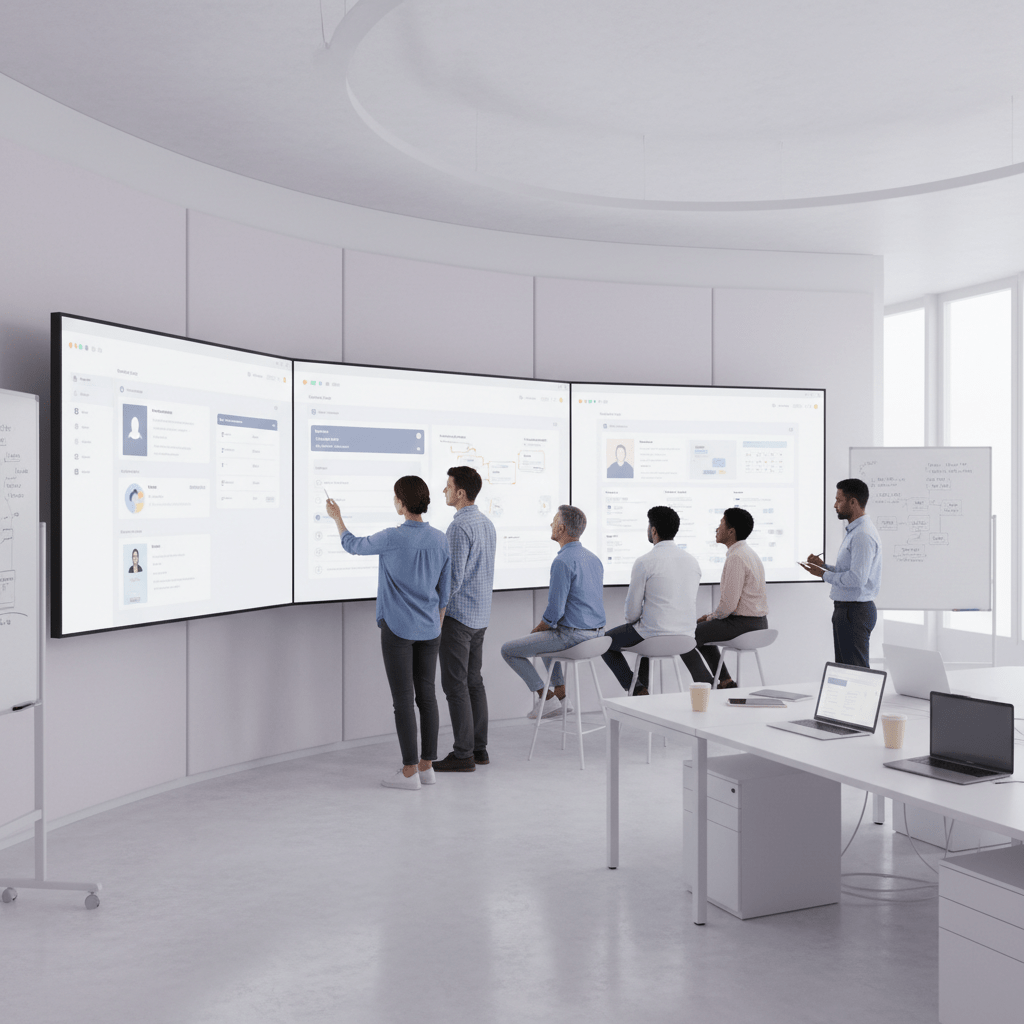
Deconstructing UX: What It Really Means for a Software Engineer
Ever build something that looked neat in a demo, but people still got stuck on the third click? Yeah. That’s UX talking.
For a lot of people in software engineering, UX gets reduced to colors, buttons, and fonts. But that’s only the surface. UX is really about how a system feels to use. Is it easy? Is it fast? Does it make sense? And maybe the biggest one, does it leave people calm or annoyed after they use it?
The formal side backs this up. The Nielsen Norman Group says UX covers all aspects of a person’s interaction with a product, service, or company, while ISO 9241-210 defines it as a person’s perceptions and responses from using, or expecting to use, a system Nielsen Norman Group and ISO 9241-210.
So no, UX is not just “make it pretty.” That myth causes a ton of trouble. UI is the screen. UX is the whole trip. It’s the path to the screen, the clicks, the errors, the waiting, the relief when something finally works. Tiny difference. Huge outcome.
And here’s the part engineers usually care about most: good UX saves time and money. Bad UX creates bug reports, support tickets, rework, and those sad late-night fixes nobody wanted. If users keep making the same mistake, that’s not just a design issue. It’s a product issue and a code issue too.
Think about it like this:
Clear flows cut confusion.
Predictable screens lower user errors.
Better feedback means fewer “it froze” complaints.
Simpler paths mean less maintenance later.
Actually, wait, there’s a better way to say it. UX is a problem-solving job, just like software engineering. We look at behavior, find friction, test ideas, and try again. That’s why teams that treat user-centered design as part of the software development lifecycle usually build better software, not just prettier software.
That matters even more in agile software development, where small mistakes can repeat fast. If a form is confusing, it gets coded, shipped, copied, and supported. If a user flow is clear early, the whole team moves with less drag. Less guesswork. Fewer “why is this ticket here again?” moments.
And yes, design choices can feel small in the room. But in real life, they stack up. A confusing label, a hidden button, a weak error message... all of that turns into extra work for engineers later.
And that’s the real lesson. UX is not decoration. It’s part of building better software.
When Satya Nadella said, “The most important thing is to put yourself in the shoes of the customer,” he basically said what strong engineers already know. If you understand the user, you write smarter code.
For teams at Buildera, that means thinking about technical UX early, not after launch. It means working with product, design, and front-end engineering as one team. It also means asking a simple question during code review: will this make sense to the person using it?
That one question can save a lot of pain.
And honestly, that’s a pretty good trade.

The Symbiotic Relationship: How UX Enhances the Software Development Lifecycle (SDLC)
Ever watched a team spend two sprints building something that looked fine in the ticket, then hear users say, “Wait... where do I click?” Yeah. That little moment hurts. And it costs real time.
That’s why UX and software engineering work better together than apart. They’re both about solving problems, reducing friction, and making the next step obvious. One side sketches the flow. The other side builds it. But in good teams, it’s not a handoff from one camp to another. It’s a shared loop.
Same job, different angle
Engineers and designers often care about the same things, just from different seats.
Shared principle | UX angle | Software engineering angle |
Modularity | Break the experience into simple parts | Break code into reusable pieces |
Consistency | Make screens feel familiar | Make components behave the same way |
Feedback loops | Watch users and revise | Ship, measure, fix, repeat |
That overlap matters. A user flow with clear steps is easier to design and easier to code. A consistent button pattern is easier to learn and easier to maintain. And a tight feedback loop means you catch mistakes before they grow legs and run around your release cycle.
There’s also a hard number behind this. According to multiple reports citing Gartner, about 70% of product launches fail because people do not adopt them. Not because the code was ugly. Not because the stack was wrong. Because the product did not fit how people work.
Why early UX changes the whole build
This is where early UX work pulls its weight.
When user research and prototyping happen before full development, teams get clearer requirements. User stories stop sounding vague. Instead of “build a better dashboard,” you get, “show the last 10 orders, flag the stuck ones, and make the next action obvious.” That kind of clarity saves a ton of back-and-forth.
And yes, it helps sprint velocity too. Fewer guess-and-fix cycles mean fewer last-minute changes. Fewer surprises in QA. Less time spent rewriting code because the flow made sense to the team but not to the user.
I’ve seen this happen in real teams. A product manager, a designer, and two engineers sit down for a 20-minute prototype review, and suddenly three “must-have” features turn into one clean path. That’s not slow. That’s smart.
Shifting left with UX
“Shifting left” sounds like one of those enterprise phrases people toss around in meetings. But here, it’s pretty simple.
It means bringing UX into the room early. Not after the build. Not after the demo. At the idea stage.
That means engineers, designers, and product managers ask the same questions from day one:
What problem are we solving?
What does success look like for the user?
What will trip people up?
What can we cut out?
When teams do that, design handoff gets much better too. The best handoff I’ve seen isn’t a giant PDF dumped in a Slack channel. It’s a shared Figma file, a prototype, clear notes, and a design system the engineers can trust. Clean. Fast. No mystery meat.
Why this matters for modern teams
For Buildera and teams like it, this is more than a nice process tweak. It’s how you build better software with less rework. It helps product engineering teams move faster without making users do the thinking.
And honestly, that’s the sweet spot. Good UX doesn’t slow engineering down. It clears the path.
If your team is modernizing old systems, shipping a new app, or untangling a messy workflow, start UX work earlier than feels comfortable. Bring the designer into sprint planning. Review prototypes with engineers. Ask what the user will feel at each step.
Small habit. Big payoff.
And that’s usually where the best software starts.

Essential UX Laws and Heuristics for the Logical Engineer
You know that weird moment when a user opens your app and just... freezes? No click. No scroll. Just silence. That usually means the screen is asking too much of their brain.
And that’s where a few simple UX laws help a lot. Not because they sound fancy. Because they match how people already think.
Jakob's Law: people want familiar patterns
Jakob’s Law says users spend most of their time on other sites, so they expect your product to work the same way. Simple idea. Big deal.
For software engineering, that means we should lean on patterns people already know. Standard login screens. Normal pagination. Regular form layouts. Familiar icons. If every button acts in a new way, users have to stop and guess. And guesswork is where errors start.
Think about it like this:
Use common library patterns when you can.
Keep navigation in places people expect.
Stick to standard keyboard shortcuts.
Don’t make users relearn basic stuff.
This matters in front-end engineering too. If your team builds a custom date picker that works “better” but looks odd, you may have just traded clarity for novelty. Was it worth it? Usually not.
Actually, wait. There are times to break the mold. But if you do, it should solve a real user pain, not just show off clever code. I’ve seen teams ship beautiful custom flows that only made onboarding harder. Pretty. But painful.
Using known patterns also helps with technical UX and the software development lifecycle. Engineers move faster when they can build on established components instead of inventing a new interaction for every screen. That helps with building better software and keeps the product feeling steady from page to page.
Hick's Law: fewer choices, faster decisions
Here’s the deal. Hick’s Law says the more choices people get, the longer it takes to pick one.
That sounds obvious, right? Yet software teams break this rule all the time.
In API design, a function with 12 optional parameters can feel like a trap. In a CLI, too many flags can scare people off. In UI navigation, a menu packed with 18 items makes users slow down and second-guess themselves. More choices usually feel helpful to the team. For the user, they often feel heavy.
So what works better?
Area | Too many choices | Better move |
API design | One giant function with tons of options | Smaller functions with clear defaults |
CLI commands | A wall of flags nobody remembers | A few common commands first |
UI navigation | Long menus with deep nesting | Simple paths and progressive disclosure |
Progressive disclosure is a fancy term, but the idea is plain. Show the next step, not every possible step. That keeps the user moving.
And yes, this helps in agile software development too. Smaller choice sets make stories clearer, testing easier, and handoffs smoother. Less “wait, what does this setting do again?” More shipping.
Feedback and Visibility: never leave users guessing
This one is huge. Users should always know what is going on.
If a file is uploading, show progress. If an API call is loading, show a spinner, skeleton, or message. If something fails, say what happened in plain words. Not “Error 503.” More like, “We could not save your changes. Try again in 30 seconds.”
That small shift changes everything.
And it’s not just nice design. It’s part of human-computer interaction. People get anxious fast when a system goes quiet. Did it work? Did it crash? Should they click again? That’s how duplicate actions, support tickets, and bug reports pile up.
A few habits help a lot:
Show loading states for background work.
Make error messages human and useful.
Confirm success after big actions.
Keep status visible during long tasks.
This also matters for developer experience. If engineers can see what the system is doing, they debug faster too. Same idea, different seat.
The nice part is that these fixes are usually small. A loading bar. A clearer message. A better default. Tiny stuff. But it saves time later, which is the whole game in software engineering.
And that’s the quiet truth: the best UX laws do not fight engineering. They support it.
If you want a quick reality check, try this: ask one teammate to test your app with no guidance. Then ask, “What do you think this page is asking you to do?” If the answer takes more than a few seconds, you’ve got work to do. Buildera teams often start there when modernizing old systems, and honestly, it’s a smart first move.
Practical UX Techniques for Engineers (No Design Degree Required)
You know that moment when a feature looks fine in code review, but users still get stuck like it’s a maze? Yeah, that feeling is a big clue. The good news is you don’t need a design degree to catch a lot of UX problems early.
And honestly, the fixes are usually simple.
1) Run a quick heuristic check
Heuristic evaluation sounds fancy, but it’s really just a smart checklist. You and a teammate look at a screen and ask, “Does this make sense?”
Start with these five items:
Heuristic check | What to look for |
System status | Does the app show what’s happening right now? |
Error prevention | Can users avoid mistakes before they happen? |
Real-world match | Does the language feel normal and clear? |
Consistency | Do buttons, forms, and menus act the same way? |
Recognition over recall | Can users see what to do without remembering steps? |
If you want a simple guide for this, the Nielsen Norman Group’s usability heuristics are a solid place to start.
My advice? Don’t try to fix everything in one pass. Pick one flow. Login, checkout, upload, whatever gets used most. Then ask, “Where would a new person freeze?”
2) Do guerrilla usability testing
This one is low-stress and cheap. Grab a colleague from another team. Give them one task. Watch for 5 minutes. That’s it.
Not a polished lab session. Not a giant research plan. Just real eyes on real behavior.
Ask plain questions like:
What do you think this page is asking you to do?
What would you click first?
What feels odd or confusing here?
What did you expect to happen after that click?
And here’s the trick. Don’t explain too much. If they get lost, that’s the point. You’re testing the product, not their brain.
I’ve seen teams find missing labels, hidden buttons, and weird form errors in one 10-minute test. One tiny fix. Huge relief.
3) Use the data you already have
You probably don’t need more meetings. You need a better look at the signals already sitting there.
Check these places:
APM logs for slow pages or broken flows
Support tickets for repeated complaints
GitHub issues for patterns in bugs or confusion
Session replay tools for places where users pause, rage-click, or backtrack
If the same complaint shows up three times in support and twice in GitHub, that’s not random. That’s a user pain point waving a little flag.
Plus, these clues help you make a case inside the team. It’s easier to say, “This form causes 42 tickets a month,” than, “It feels clunky.” Numbers get attention.
A quick way to think about it
Heuristic check catches obvious friction.
Guerrilla testing shows how real people behave.
Support and log data show where pain keeps coming back.
Use all three, and you’ll spot more issues before release.
That matters because poor adoption is a real drag. Reports citing Gartner say about 70% of product launches fail because people don’t adopt them, and that lines up with the bigger truth here: if the experience feels confusing, people bail. Also, Satya Nadella said it best: “The most important thing is to put yourself in the shoes of the customer”.
That’s the whole job, really. Build software people can use without a cheat sheet.
If your team is trying to modernize an old product, Buildera can help with custom software development, product engineering, and legacy application modernization. Sometimes the fastest way to improve UX is to fix the system behind it.
Measuring Success: Connecting UX-Focused Engineering to Business ROI
You know that moment when a leader asks, “So what did that UX work actually do?” Fair question. If we can’t answer it, the conversation gets awkward fast.
Here’s the good news. UX work is not just about nicer screens. It shows up in the numbers leaders already watch: user activation, feature adoption, session length, churn, and support cost. When people can use a product without bumping into friction, they stick around longer. They try more features. They need less hand-holding.
And the business case is stronger than most teams think. Reports citing Gartner say about 70% of product launches fail because people don’t adopt them, not because the code is broken. That’s a big clue. If users don’t get value fast, the product slips. Simple as that.
A strong UX focus can move a few key metrics:
UX change | Business result |
Clearer onboarding | Higher activation rates |
Easier flows | More feature adoption |
Better feedback and visibility | Longer session times and less rage-clicking |
Fewer confusing paths | Lower churn |
Fewer support traps | Lower support costs |
And yes, support costs matter more than people think. If a screen answers itself, users don’t open a ticket. They don’t email support. They don’t sit on chat for 12 minutes asking where the export button went. That saves money and time.
Here’s the deal. Engineers usually get pushback on UX work because it sounds soft. It isn’t. It’s a product quality fix. So when you want time for UX improvements, talk in plain business language:
“This flow is causing drop-off at step 2.”
“We’re seeing repeat tickets on this form.”
“Accessibility fixes will cut support load and widen reach.”
“This UI debt is creating rework every sprint.”
That last one lands well with technical leaders. UI debt is real. So is accessibility debt. If the interface is hard to read, hard to tab through, or hard to understand on mobile, the cost keeps coming back.
Actually, wait. The best framing is probably this: UX work is not extra polish. It is a cheaper way to prevent rework later. And it helps teams build better software that people can use without a cheat sheet.
For Buildera teams working on custom software development, product engineering, or legacy application modernization, this is where the UX and engineering worlds meet. A small change in the flow can mean fewer support calls, better retention, and faster rollout for new features. That’s the kind of ROI leadership pays attention to.
So if you need to make the case, start with one question: what user problem is causing the most business pain right now? Find that, fix that, and the numbers usually follow.
Conclusion: The Engineer as the Ultimate User Advocate
A feature can be clean in code and still flop in real life. We’ve all seen it. And honestly, that’s the part that sticks with you.
The big idea here is simple: UX is not a side job. It is part of high-quality software engineering. When engineers care about user-centered design, human-computer interaction, and technical UX, they build better software with less guesswork and less rework. That helps the team, the user, and the business.
And the payoff is real. Reports citing Gartner say about 70% of product launches fail because users do not adopt them, while other research shows most built features barely get touched at all Gartner product launch failure stats. So if we want software that matters, we have to think past the code and into the experience.
Also, it makes the job better. You spend less time fixing avoidable bugs, fewer hours untangling support issues, and more time building things people actually use. That feels a lot better than shipping into the void. Trust me.
Here’s a quick checklist for your next sprint:
Review one user story for UX assumptions.
Spend 15 minutes watching a user session recording.
Pair with a designer on one component.
Add one clear loading or error state.
Ask, “Would a new user know what to do next?”
Small steps. Big shift.
Satya Nadella said, “The most important thing is to put yourself in the shoes of the customer.” That’s the job now. Not just writing code, but speaking up for the person on the other side of the screen.
And if you’re on a team modernizing old systems or building a new product from scratch, that mindset can change everything. It’s one of the fastest ways to cut wasted effort, grow your own value, and feel proud of what you ship.
Ready to build software that actually works for your business?
Free discovery call · 15 minutes · No obligation